Trajan Sucks... Sometimes
Ahem. I just want to warn everybody in advance that I'm going to geek out for this post and probably discuss something that probably few people care about. I'm going to talk about typography.

 You see what I'm talking about? The type in the top graphic actually conveys the words as though they are true, making the text appropriate for advertising featuring a spa, a couch, or even Calgon bubblebath. The second graphic subverts the meaning of the words by merely changing typefaces. Instead of conveying the feeling of relaxation, the type signifies animation and excitement. Now, the text has become totally inappropriate for the uses I mentioned before, and would instead might appear in an advertisement for an amusement park, or more likely a novelty t-shirt. To better illustrate this, I've even slapped together a couple more examples below.
 So, there you have it, a couple of examples of how type can have a meaning all it's own, no matter what the words actually say. In other words, choosing the right typeface for the right job is one of a designers most important tasks. The importance of this task, however, has recently been disregarded or discarded by my alma mater, The University of Kansas.
Here's the deal, The University of Kansas recently went through a rebranding and changed their typeface to Trajan. Without going into too much detail, basically this means that from now on whenever you see their brand on things like stationery, signage, advertising, etc., it will always be in Trajan, as opposed to say, Times New Roman or whatever random typeface any doofus with a PC might choose.
 To this:
 For the love of God, why? Now, I'll admit that it doesn't look as bad on the basketball jerseys, but it really looks awful on apparel that features just the KU emblem. Just take a look at the hats below. The one on the left features text set in Trajan and the one on the right isn't even set in KU's previous sports typeface and it still looks better than the one set in Trajan!
 Now, I could get all KU fan-boy on you an go off in how replacing the now classic letterforms that adorned the KU jerseys for last 25 years (during which the men's basketball team earned 5 Final Four appearances, 3 NCAA Finals, and one national championship) flies in the face of tradition. But, I think it would be more productive to make the case from a visual identity or branding standpoint, because while the university may not have had a cohesive and recognizable brand, KU athletics already did. KU athletic apparel had not only the Jayhawk, but their own typeface that was immediately recognizable and unique to the University. Now, they've flushed that all away and replaced it with a typeface that, in the context of jersey, looks not only generic, but, well, wimpy. Generic, I can stand, but wimpy? On a sports apparel? Not exactly the image you want to convey.
And just so you know, I'm not the only person upset about all of this. In fact, this entire post was inspired by a website that Josh put me on to called trajansucks.com. Judging from the comments posted on the site (some of which are not even from KU fans) the consensus is that at least when it come to KU jerseys, Trajan, does indeed suck. So, if you agree with me and the many others that think Trajan has no place on sports apparel, stop on over and buy one of their snazzy shirts or at least post a comment. Of course, I did both. Maybe it'll do some good, you never know. After all, Nebraska changed their football uniforms back in 2002, and that lasted all of one season. So there's still some hope to be had.
Before I go, I'd like to make an admission, I actually have a KU hat with KU set in Trajan. There's even a couple of pictures of me wearing it on this blog. But, in my defense, it was the only St. Patrick's Day-styled KU hat I could find here in Omaha. But rest assured, I will try to make that the only KU apparel I have featuring Trajan. But now that they've even put Trajan on the freakin' Jayhawk, I don't know if I can.
Sigh. Oh well, at least I can wear my "Trajan Sucks" shirt if all else fails...
In my line of work, typography is not only essential, but one of my favorite subjects. It's not just about using letters to make words, it's also about choosing what words you want the audience to read in what order, how easily you want the audience to be able to read those words, and how you want your audience to perceive those words. As the great typographer and graphic designer Neville Brody once put it it:
"Typefaces control the message. Choice of font dictates what you think about something before you even read the first word. Imagine Shakespeare in large capital drop shadow. Our response would be quite different towards the content."
Sounds complicated, right? Well, it is. But let me make it a little easier to follow with a little visual example of how different typefaces can be used to make the exact same words have totally different meanings:
You see what I'm talking about? The type in the top graphic actually conveys the words as though they are true, making the text appropriate for advertising featuring a spa, a couch, or even Calgon bubblebath. The second graphic subverts the meaning of the words by merely changing typefaces. Instead of conveying the feeling of relaxation, the type signifies animation and excitement. Now, the text has become totally inappropriate for the uses I mentioned before, and would instead might appear in an advertisement for an amusement park, or more likely a novelty t-shirt. To better illustrate this, I've even slapped together a couple more examples below.So, there you have it, a couple of examples of how type can have a meaning all it's own, no matter what the words actually say. In other words, choosing the right typeface for the right job is one of a designers most important tasks. The importance of this task, however, has recently been disregarded or discarded by my alma mater, The University of Kansas.Here's the deal, The University of Kansas recently went through a rebranding and changed their typeface to Trajan. Without going into too much detail, basically this means that from now on whenever you see their brand on things like stationery, signage, advertising, etc., it will always be in Trajan, as opposed to say, Times New Roman or whatever random typeface any doofus with a PC might choose.
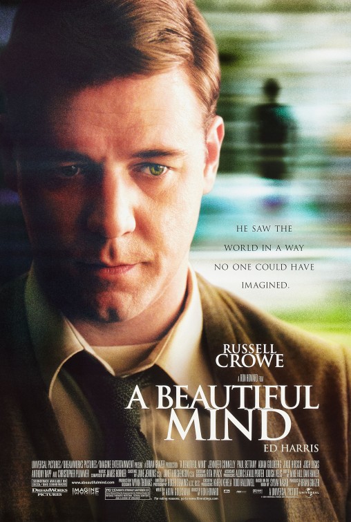
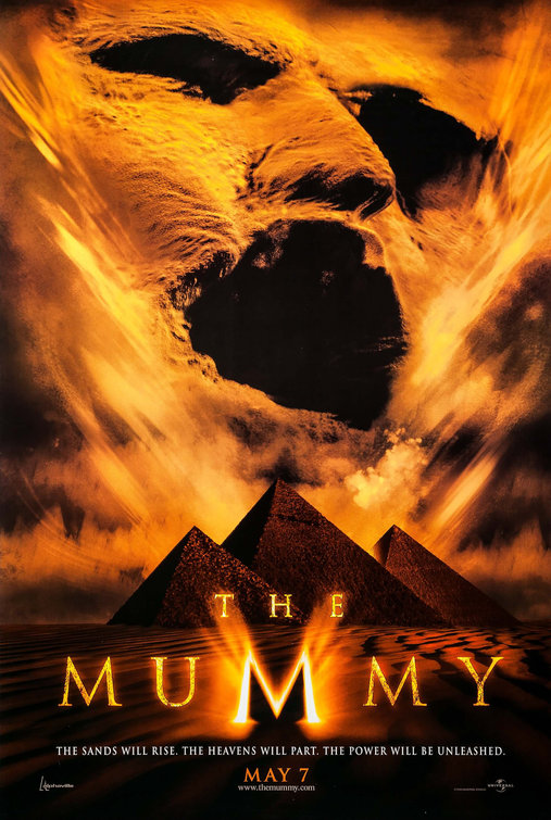
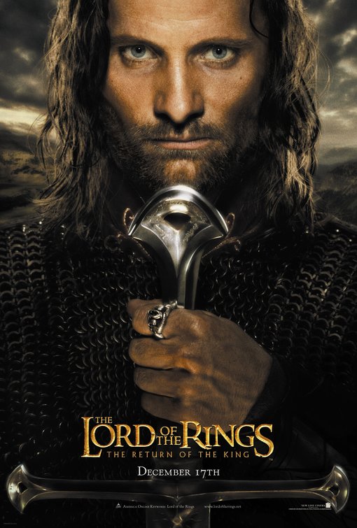
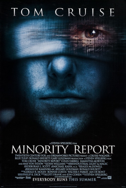
My problem, therefore, is not that KU has committed itself to an extensive rebranding was actually a smart thing to do, as establishing a consistent, universal typeface helps make your brand more recognizable and cohesive. Nor do I have a problem with KU using Trajan as their typeface. Sure, it's becoming about as overused as Helvetica and it's seen everywhere from The West Wing to just about every movie poster for the last 20 years (seriously, it was used on the posters for A Beautiful Mind, The Pefect Storm, The Mummy, Titanic, all 3 Lord of the Rings movies, and even Minority Report. The list goes on and on, and I'm not even mentioning the countless posters that use typefaces that are derivatives of Trajan!). In the end, I like Trajan in the right context, and I think it works as the typeface for a university. It is, after all, based on the letterforms found on a column in Rome and most all universities like to pay homage in one way or another to Rome for having the first university. Take a look at it here on KU's homepage. When used in this instance, Trajan works, and I think it works pretty well.
My problem is context. Just about any typeface can work in the right context and while Trajan may work for representing the academic side of a university, it is woefully out of place on the athletics side. I would think that would be obvious to even the most casual of viewers, but apparently not, because the University of Kansas in their attempt to standardize the KU brand has actually started using Trajan on their jerseys and other sports apparel! Which is to say, the KU emblem an their jerseys went from this:
To this:For the love of God, why? Now, I'll admit that it doesn't look as bad on the basketball jerseys, but it really looks awful on apparel that features just the KU emblem. Just take a look at the hats below. The one on the left features text set in Trajan and the one on the right isn't even set in KU's previous sports typeface and it still looks better than the one set in Trajan!Now, I could get all KU fan-boy on you an go off in how replacing the now classic letterforms that adorned the KU jerseys for last 25 years (during which the men's basketball team earned 5 Final Four appearances, 3 NCAA Finals, and one national championship) flies in the face of tradition. But, I think it would be more productive to make the case from a visual identity or branding standpoint, because while the university may not have had a cohesive and recognizable brand, KU athletics already did. KU athletic apparel had not only the Jayhawk, but their own typeface that was immediately recognizable and unique to the University. Now, they've flushed that all away and replaced it with a typeface that, in the context of jersey, looks not only generic, but, well, wimpy. Generic, I can stand, but wimpy? On a sports apparel? Not exactly the image you want to convey.And just so you know, I'm not the only person upset about all of this. In fact, this entire post was inspired by a website that Josh put me on to called trajansucks.com. Judging from the comments posted on the site (some of which are not even from KU fans) the consensus is that at least when it come to KU jerseys, Trajan, does indeed suck. So, if you agree with me and the many others that think Trajan has no place on sports apparel, stop on over and buy one of their snazzy shirts or at least post a comment. Of course, I did both. Maybe it'll do some good, you never know. After all, Nebraska changed their football uniforms back in 2002, and that lasted all of one season. So there's still some hope to be had.
Before I go, I'd like to make an admission, I actually have a KU hat with KU set in Trajan. There's even a couple of pictures of me wearing it on this blog. But, in my defense, it was the only St. Patrick's Day-styled KU hat I could find here in Omaha. But rest assured, I will try to make that the only KU apparel I have featuring Trajan. But now that they've even put Trajan on the freakin' Jayhawk, I don't know if I can.
Sigh. Oh well, at least I can wear my "Trajan Sucks" shirt if all else fails...
posted by Christian at 9:13 AM
![]()


5 Comments:
I totally agree with you, except for one thing: Helvetica cannot possibly be overused.
Nick-
I'm not sure if you're being serious or not, as you and I have actually had a discussion about how Helvetica is actually, in your words I believe, "pretty great." That discussion was prompted, in fact, by Max's shirt that proclaimed "Hel FUCKING Vetica."
But I have to say that I do think Helvetica was overused, which is why there's such a backlash against it these days. Seriously, google "I Hate Helvetica" and you'll find a ton of hits, including forums dedicated to hating on the typeface.
And honestly, I think that the Mac is to blame. Not only did the Mac seem to make everybody and their sister a desktop publisher, but the Helvetica font was included on their computers, and was used as a default font for many of it's applications. To this day the iPod and iPhone use Helvetica almost exclusively.
But I love Helvetica and, like I said, I think that Trajan's a decent font, too. It's not the fault of the typeface, after all, that people are overusing them or using them incorrectly.
By the way, I guess they go into a lot of this, in the documentary Helvetica. Which I can't wait to see. It's supposed to be awesome, and not just according to designers either. Even Ain't It Cool News gave it a good review! The DVD comes out November 9, so hopefully, I can find a copy around here somewhere.
And speaking of movies, Veer has one on Trajan that you can watch on their website. It's kind of silly, but still worth checking out.
And finally, I give you Helvetica vs. Arial the game.
I saw your post on the Trajan sucks website the other day! I was like, I KNOW HIM!
My sis saw the Helvetica doc and said it was great. I am now the proud owner of an "I Hate Helvetica" pin (she wasn't sure where i stood on the issue). Can't wait to see it.
Kate-
Good to hear from you! And you should know by now that I'll keep turning up like a bad penny (I don't even know what that saying means, but that's not going to keep me from using it).
Nick-
Perhaps you can rectify your unfortunate button situation by purchasing these handsome buttons. You can purchase them here.
Post a Comment
<< Home